Pressto
Branding and responsive web design for a unique service that helps share content across multiple online channels.

Creating a brand personality. Being an innovative startup, Pressto needed a strong brand identity. We created a memorable brand that’s more than just a logo.
Designing an effortless interface. With a product that’s so simple, we developed a minimal but playful identity to make tasks easy.
Developing a sophisticated user experience. We defined the user journey through a series of simple and manageable steps. Tasks are completed quickly and intuitively, with no technical know-how necessary.


A branded experience
Developing a characterful identity
Digital startups often lack personality and warmth. When developing Pressto with its founder — a San Fransisco based WIRED editor — our strategy was to design an identity that’s full of character. An identity is much more than a logo, so we created a holistic visual strategy that encompasses the friendly Pressto character.
brand identity
Our designs were focused on combining two key overlapping colours, with a pipe-like form. This flexible approach represents the concepts of connecting digital channels and simultaneously pushing data.

Simple controls
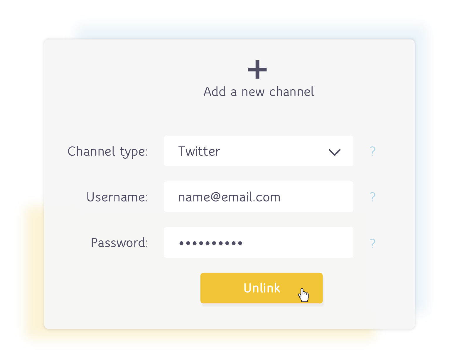
Through experimentation, we reduced and refined steps to their basic actions. This makes setting the app up a breeze, with help always on hand if you need it.

responsive design
An interface optimised for mobile
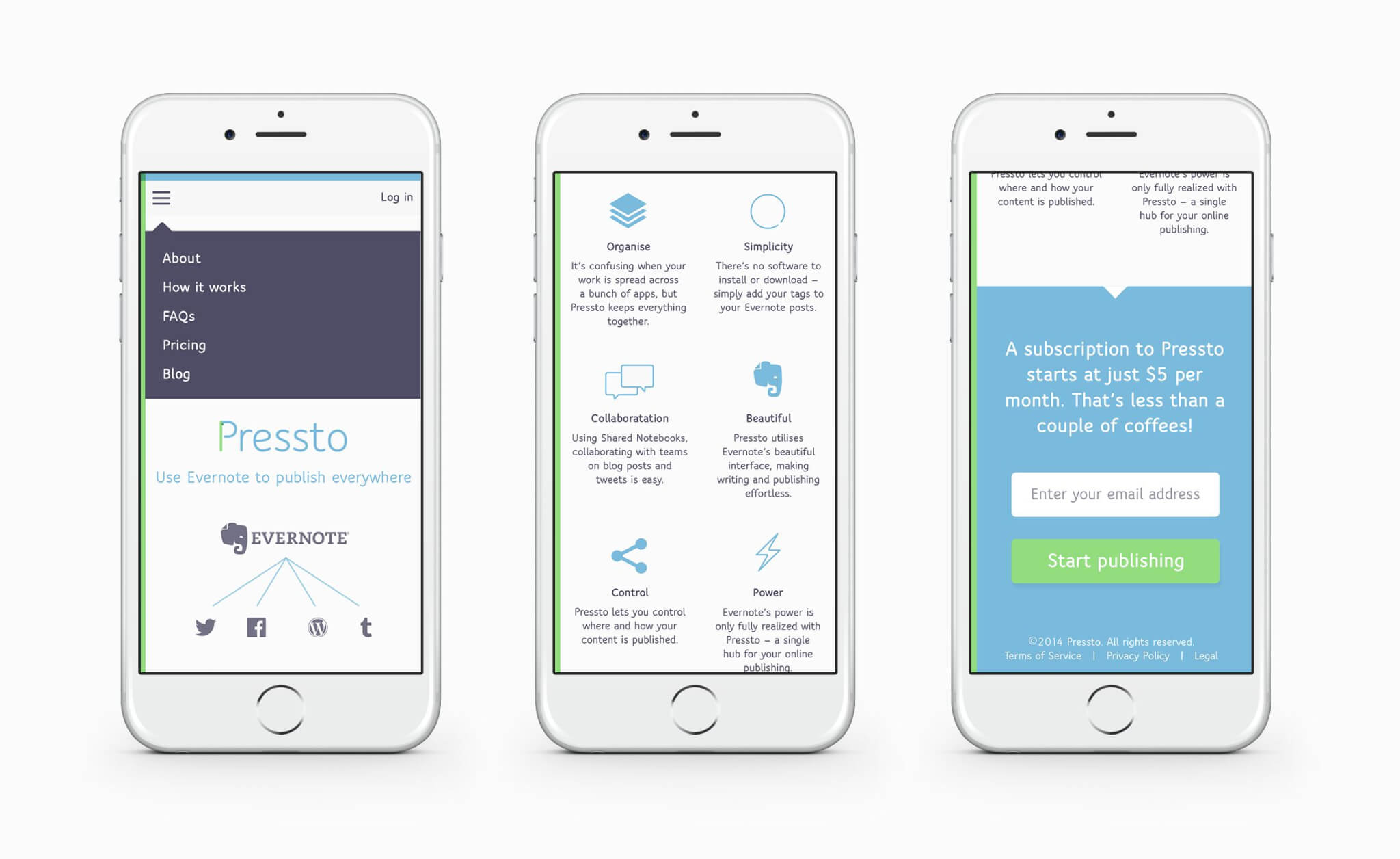
Pressto is all about automation. It’s targeted towards power users that need to publish content across multiple social channels. Pressto makes it easy to do this on the move, so we designed the interface with a mobile first approach. Mobile users tend to be very goal-oriented, so key tasks are designed to be quick and simple to complete.

THE CTA
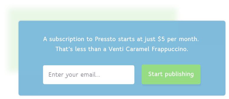
Pressto follows a subscription model, so primary call-to-actions on sales pages need to be visually prominent and engaging. We gave users context, by comparing the low monthly cost to a Starbucks.

tone of voice
Developing a confident and helpful tone
To make the brand more distinctive in a crowded automation and publishing space, we helped Pressto develop a personable tone of voice. It’s direct, but friendly. It doesn’t slow you down, and it makes tasks more understandable. A crucial part is that language isn’t patronising to developers, nor jargon to everyday users.

user experience
Seamless user journey
Getting Pressto to automate publishing content from your Evernote files is simple, but you have to connect all your accounts to get started. We developed a simple architecture and split key tasks into manageable steps. This linear approach ensures reduces errors, and reduces frustration.
flexibility
By their very nature, startups grow and evolve. When approaching Pressto’s branding and user interface, we made sure they could grow too. This saves money, reinforces brand recognition, and fosters loyalty over time. There’s no point starting from scratch each time the business plan changes.

How we worked with the team

Marvel lets us prototype and refine, with contextual presentation

We use Adobe CC for designing and animating assets

We design high fidelity UI in Sketch for fast, responsive, and accurate handover
We're always looking for new challenges and experiences. Whether you're a tech startup, one man band or large established agency, we'd love to hear from you. Get in touch →