Netball Scoop
Responsive web design for a global digital Netball community and magazine.

Not alienating existing users. Netball Scoop is all about Netball. Starting out as a digital magazine based in Australia, it’s developed into a lively global community with thousands of active users.
A major redesign. Netball Scoop commissioned us to audit their existing website, and implement changes to the look and feel, user experience, increase the number of paid subscribers, and optimise it for mobile users.
Making a digital magazine worth reading. Reading on screen can be difficult, so we’ve implemented new layouts, typography, and styling to make the reading experience enjoyable and engaging.


Starting with the basics
We started the process by fast, iterative wire-framing and experimentation. Before looking at styling, this enabled us to develop a well defined user journey and intuitive user experience. Content is optimised for tablet and mobile users at every stage.

Information architecture
Simple but intuitive architecture
With new content being added daily, we started the redesign by making improvements to the site’s information architecture. We restructured content, introducing well defined categories based on output frequency. Well considered labelling and colour coding helps new users navigate the site with ease.
A colour-coded platform
Part of defining the information architecture of the platform was to introduce simple colour coding. Each part of the site — and each type of content — has its own identity. This helps content be memorable, and users to orientate themselves when exploring the site.


responsive design
Optimising the platform for mobile users
Users were getting increasingly frustrated that they couldn’t read new articles and join the conversion from their mobile devices. People are five times more likely to leave a mobile site that isn’t mobile-friendly. A big part of our work was restructuring the site to create a sophisticated mobile experience without sacrificing any richness of content. The site is now easy to navigate, read and engage with on the fly.
Moving to a paywall
Part of our task was to increase the brand’s revenue through introducing premium content for paid subscribers. We introduced premium article previews, together with tempting paywalls. Premium articles were given rich formatting and exclusive typography to create a quality experience and greater definition.

user experience
Making the magazine browsable
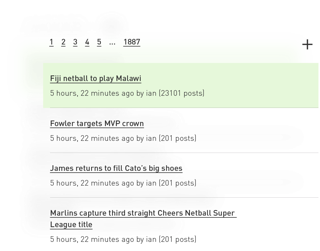
It’s easy to flick though printed magazines, but online there are more distractions and more hurdles to get through. We developed a sophisticated user experience with the context of users in mind, that makes it easy to browse articles from each issue.

Restrictions of a forum
A surprisingly big part of the Netball Scoop platform is the forum. It’s home to endless threads from thousands of active — and very passionate — users. Whilst working within the technical restrictions, we made forums much easier and quicker to use. This involved optimising them for mobile, where users wanted to quickly reply on the go throughout the day.


readability
Making articles easy to read
Having quality content is useless if it’s hard to read. When developing a design strategy for Netball Scoop, readability was at the heart of our approach. We concentrated on reducing eye-strain, picked webfonts optimised for screen-reading, and focused on considerate typographic layouts.
Community functionality
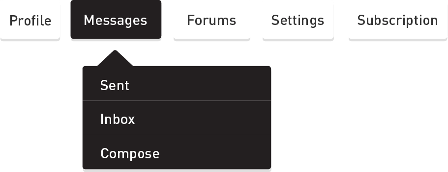
The community is at the core of Netball Scoop, so we designed a series of sophisticated features that let users send private messages to each other, manage their profile, and tailor their experience. All with a beautiful and fresh user interface.

user interface
Designing a fresh interface
Although Netball is predominately played by women, there shouldn’t be any visual stereotypes. It’s a serious sport. We developed a distinctive and contemporary visual language, combining a fresh but solid palette with deep greys. It’s friendly and approachable, with an underlying sports-like drive.
Simple sign in
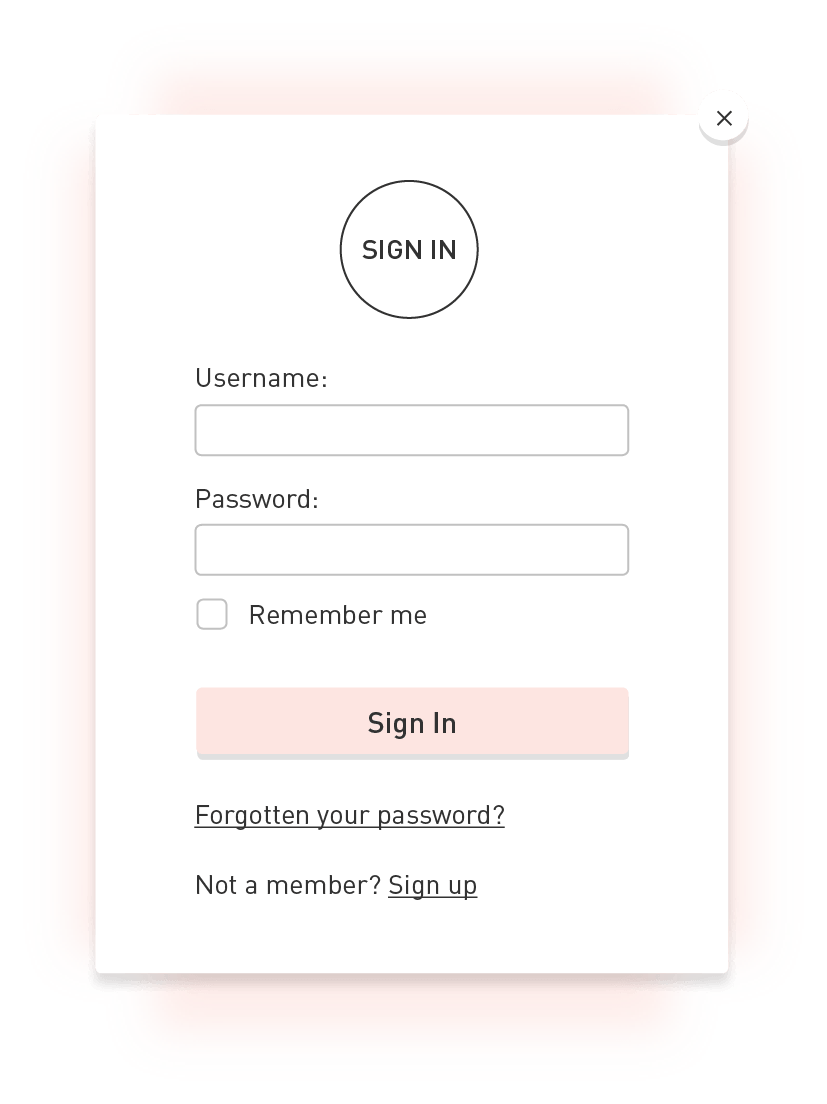
We made the experience of signing into the site as easy as possible with a small, unobtrusive modal. This lets users stay on the page they’re looking at, and continue their journey through the site without friction.

Working with an existing user base
Keeping them happy
With a loyal and passionate user base, it was important not to alienate Netball scoop fans when new designs and functionality was introduced. Before and throughout the project, we listened to users to understand what they wanted changing, and made this the focus of our approach.
netball scoop in the wild
We are down to 2 GKs fighting it out for #NSPlayerOfTheYear! @LizzyLegsEllis will be pleased! Who's your pick? pic.twitter.com/4QR81pWaha
— Netball Scoop (@NetballScoop) June 6, 2015
#NewOnNS: match report from #VIXvFIR @TheFirebirds make it 16 in a row by @bcarbonaro85 https://t.co/OwZQ96LpGz pic.twitter.com/8pmFEarB2j
— Netball Scoop (@NetballScoop) April 18, 2016
#NewonNS: @madirobinson_ will lead the @MelbourneVixens in 2016! @bcarbonaro has the story: https://t.co/mM9zNyItdf pic.twitter.com/pR1dzOl5Ax
— Netball Scoop (@NetballScoop) February 10, 2016
How we worked with the team
We use Slack for seamless dialogue with clients and developers

Marvel lets us prototype and refine, with contextual presentation

We use Adobe CC for designing and animating assets
We're always looking for new challenges and experiences. Whether you're a tech startup, one man band or large established agency, we'd love to hear from you. Get in touch →